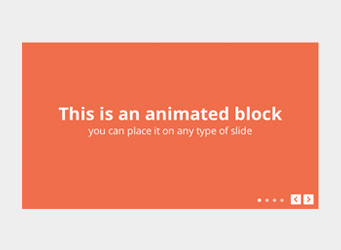
This is an animated block, add any number of them to any type of slide
Put completely anything inside - text, images, inputs, links, buttons.

This is a static HTML block
It's always displayed and not animated by slider.

Touch events are disabled over this text to allow selection
You can add this behaviour to any element inside of slide just by adding 'rsNoDrag' CSS class to it.
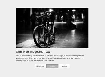
 Photos by Gilderic