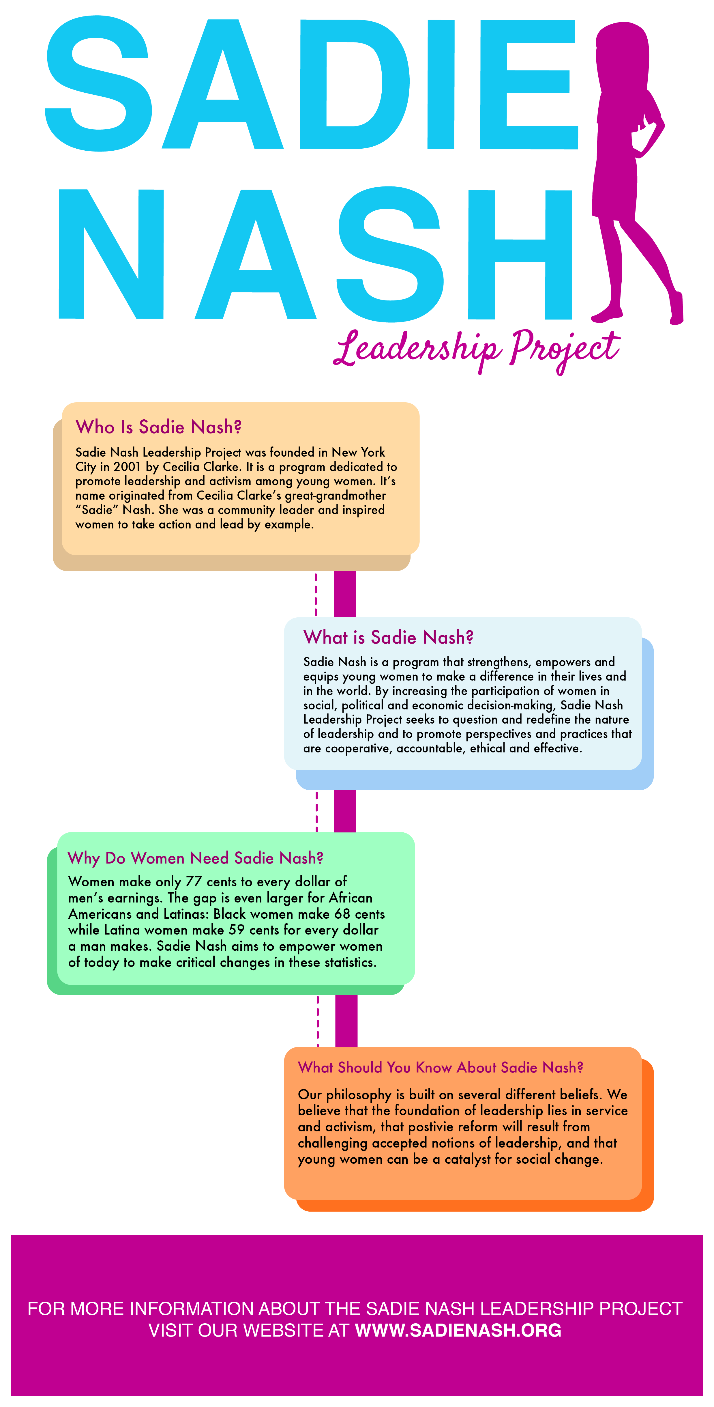


For this particular info-graphic I wanted to keep it simple. I chose colors that coordinated with the Sadie Nash website we were given as inspiration. They use a lot of young and fresh colors, and I decided to stick with that. I also feel I have created a strong hierarchy with this composition. There is a clear diagonal moving the eye from the top to the bottom of the page.
As far as content is concerned there was a ton of information about the Sadie Nash Leadership Project. To keep it simple and effective, I only incorporated information that answered the questions who, what, where, and why. At the bottom you will find the web address for the actual Sadie Nash website, so that if interested, the viewer is welcome to learn more.
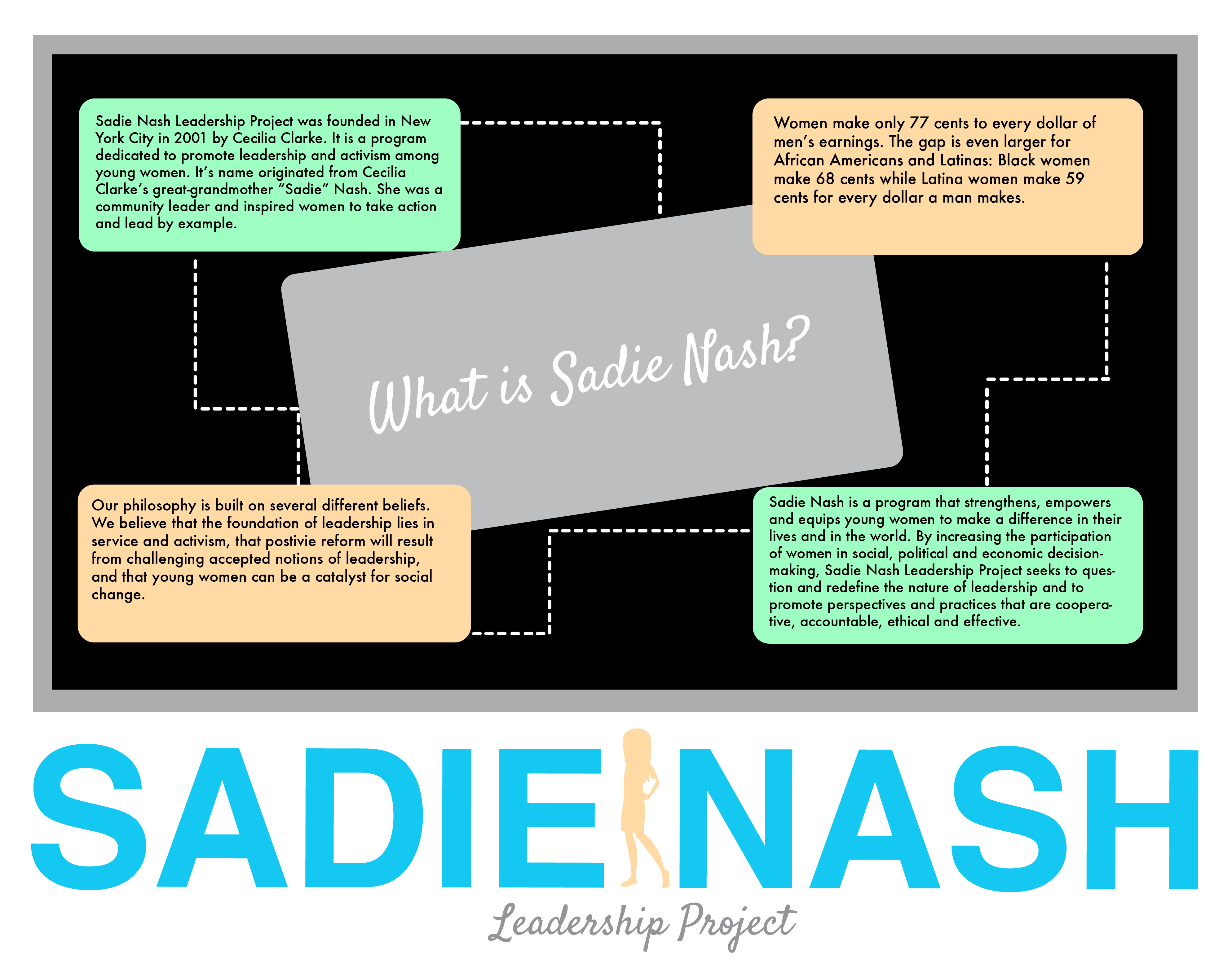
For my second info-graphic option, I decided to incorporate a little more creativity. I wanted to make the info-graphic to look like a chalkboard in class, bringing in a main idea in the Sadie Nash Program (learning and education).
Although I kept the same idea information wise in this option, I feel it has a creative edge that the other option lacks. The only issue I see with this option is hierarchy. It is not as easy for the eye to distinguish what is most important in the info-graphic.
