MGM GRAND
http://mgmgrand.com
Alex Bullen
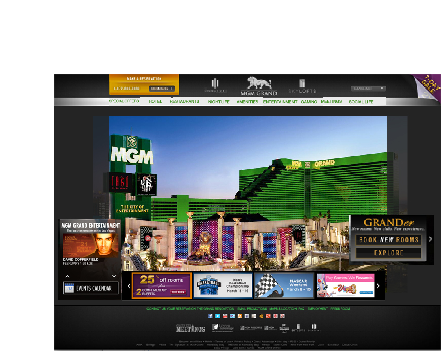
The Hotel I was assigned was the MGM grand. In my opinion they have a great website that is extremely easy to navigate through. There is a lot of information on the website but there is really no confusion as to where to go to find it. I do think that the homepage could try to capture the LAS VEGAS vibe a little bit more, but it definitely has a look and feel of quality which seems reflective of the establishment.
Interior page:
I marked the sliding navigation system they have on their interior page with a star and a line to illustrate how you can slide across the various options. I think this is highly functional and I wouldn't change anything about it.
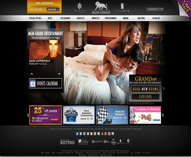
For the recration I couldn't really find all that much that I felt needed to be altered except I thought that the homepage should definitely stay with the photo of the exterior of the hotel just because I feel like the exterior view is more appealing than two random people inside a hotel room. Also I thought it would be cool if the text matched the color of the building in order to stand out a little bit. The other thing I altered was bringing the event square down to the bottom to create more balance and have all of the box features at the bottom of the page. One other thing I would add is a search bar at the top just because there is so much information on the website.